For a person, day and night are the two colors of life; for a city, day and night are two different states of existence; for a building, day and night are completely in the same line. But each wonderful expression system.
Faced with the dazzling sky that swarms up in the city, should we think about it, do we really need to be so dazzling? What does this dazzling have to do with the building itself?
If the space of the building depends on light to be visually presented, then the main body of the architectural lighting is obviously the building itself, and a proper fit between the two needs to be achieved.
No one can understand more deeply and accurately explain the relationship between light and architecture than a senior architect. As a well-known architectural designer, Mr. Xu firmly believes that architectural lighting design is not a re-creation outside of the building, but an extension of architectural design. It should be based on a "deep" understanding of architecture, through the control and expression of light Means to reflect the character and characteristics of the architectural space; at the same time, the architect should also leave a basic space for the realization of the lighting of the building.
He advocates the use of light in a "moderate" way, and will start with the "light-seeking journey" of many typical landmark buildings that he has personally experienced or witnessed to deconstruct how buildings are born of light.
1. Form description: the three-dimensional representation of the building volume;
2. A summary of architectural features: there is no concept of artistic expression without focus;
3. The performance of texture and level: use the intensity change of the light layout, the difference between light and dark;
4. The rendering of character and atmosphere: light plays a decisive role in the performance of space quality, artistic appeal and human psychological experience.
Building facade lighting expresses the three-dimensional building volume
1. Grasp the distinctive features of the building and sort out the key points of the design
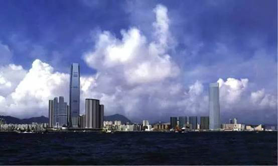
Hong Kong Global Trade Plaza is a typical super high-rise building located on the Kowloon Peninsula, with a usable floor level of 490 meters, designed by the architectural firm Kohn Pedersen Fox Associates.
We can see that the shape of the Global Trade Plaza is very square and simple, but it is not a straight rectangular cuboid, but recessed on four sides, like four skins on the four sides of the building, and at the beginning and ending parts, There is a gradual trend, therefore, the four sides of the inner groove become the most characteristic expression language of the entire square building.
Using light to "outline the building outline" is the most common way to express the shape of the building under the night. Architects also hope to use the outline to illuminate the building's facade. Therefore, starting from the above architectural features, the key issue has evolved into: How to use light to express the shape of the four sides and four concave grooves.


Picture: From the floor plan, you can see the Founder Global Trade Plaza more clearly, the shape of the grooves on the four sides of the building, the commonality seeks individuality, and the concave setting is undoubtedly the outstanding feature of the building's exterior facade of the Global Trade Plaza.

Picture: After sorting out, the focus of the building's exterior lighting design has fallen on how to illuminate the inner groove.
2. Multi-party demonstration and testing, seeking the best expression and realization method
How many ways can we illuminate the inner groove? What are the pros and cons and performance? The designer chose to infer one by one through simulation effects and implementation methods to find the best way of expression:
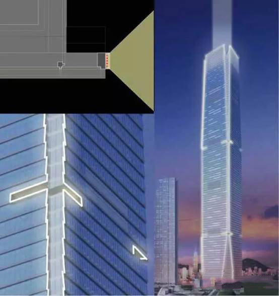
Option 1: Linear expression at the edge of the outer curtain wall, and lighting at the edge structure.

Scheme 1 Schematic diagram and simulation effect of lighting. Through the simulation effect, we can clearly see that the side lines of the exterior curtain wall structure of each layer are emphasized due to the lighting, and the local lines become fragmented. The overall effect is abrupt and hard due to the line brightness and the excessive contrast of the surrounding volume.
In fact, because the results obtained by this linear description method are more robust and flat, the plan was abandoned by the designer.
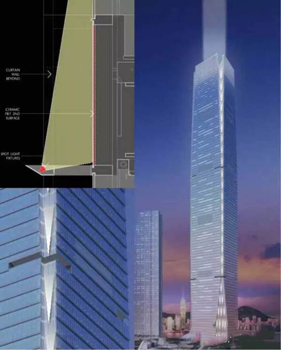
Scheme 2: Plane expression of the inner curtain wall at the recessed angle, and projection lights on the outside of the layered glass curtain wall.

Scheme 2 Schematic diagram and simulation effect of lighting. The most significant difference between this scheme and the previous scheme is the progression from "line bright" to "surface bright". The glass at the projection position is glazed or frosted to allow it to receive more diffuse reflections, so that The flat surface of the glass in the recesses on the four sides is lit up, creating a three-dimensional effect from a distance.
The disadvantage of this scheme is that due to the light-emitting characteristics of the projection lamp, the projected surface will intermittently produce obvious conical light spots, which makes the entire building corner lines express a sense of frustration. Therefore, the second scheme was also abandoned by the designer.
Scheme 3: Linear spotlights uniformly illuminate the structural shadow box, and the rectangle outlines the architectural structure lines.

Perhaps some students can already imagine it, yes, the improvement of Scheme 3 is to upgrade the "face-bright" to "body-bright". Enlarging the part of the building, between the building skins, some looming "steel structure" is exposed to form a "shadow box". The linear projection lamp illuminates this part of the shadow box to realize the light "seepage" at the four corners. The feeling of "come".

At the same time, in the third plan, when expressing the shadow box, the horizontal structural lines in the building were also emphasized. The simulated effect is surprising, and this is the lighting design plan finally selected by the designer.
3. Summary: Architectural lighting is a re-creation based on understanding architecture
Founder's buildings are everywhere, but how to find the individuality in commonality? For example, the four groove sides of the Global Trade Plaza and the gradual starting skin.
Is the outline of the building the same as the outline? In the first plan, it is also a hook, why was it abandoned?
"Tough" and "soft" sound like very subjective words. How to grasp the scale between these subjective words in the process of understanding architecture?
To solve the above problems, it seems that there is no "instruction" to read through, but it is certain that the key to understanding architecture lies in good communication and the grasp of people's behavior patterns and feelings.
Media Contact
Company Name: Eurborn Co., Ltd.
Email:Send Email
Phone: +86 769 23022798
Country: China
Website: https://www.eurborn.com/
